
Time flies, but aesthetics are eternal.
It all begins with your idea, brought to life through our expertise and guided by your vision.
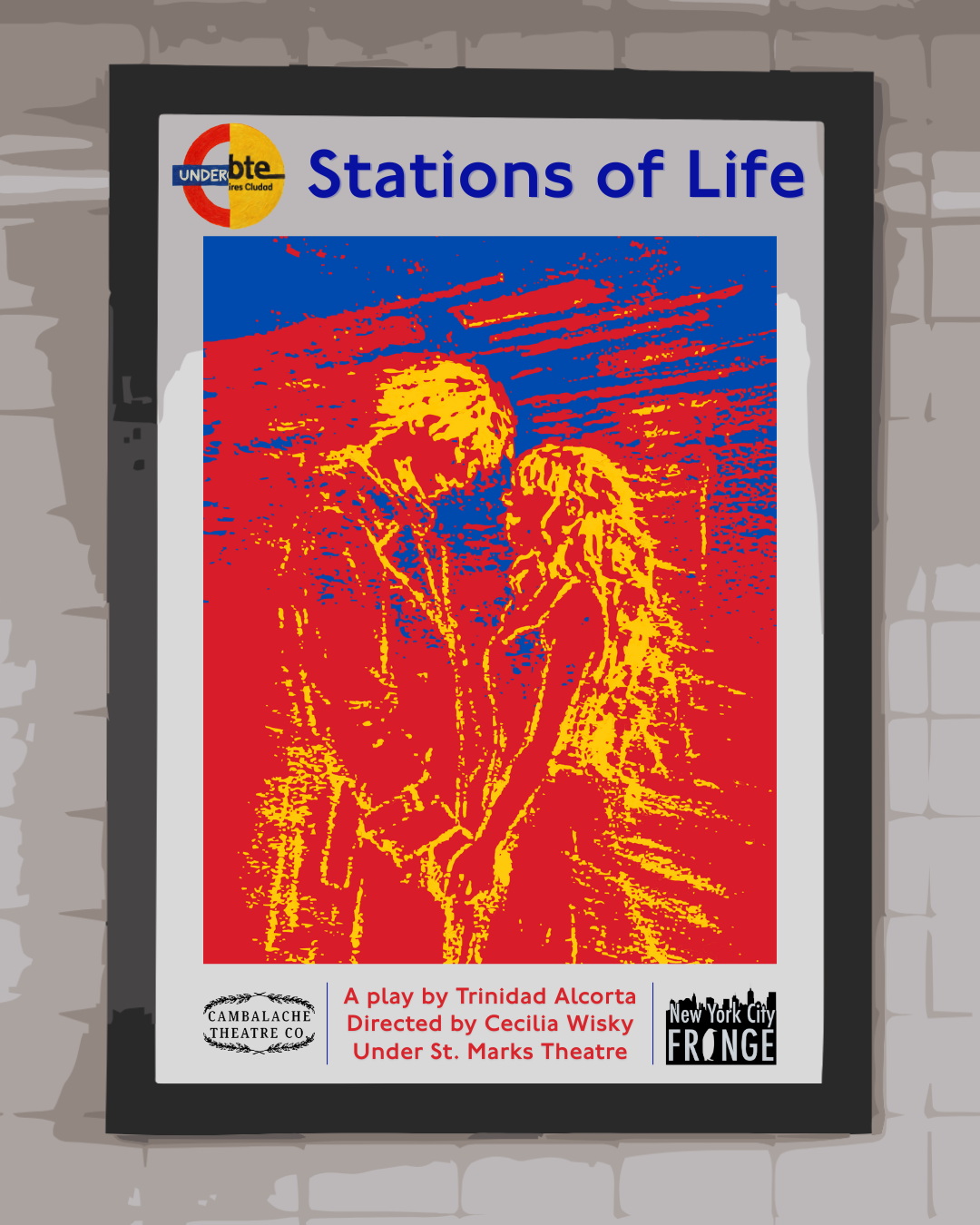
Stations of Life
This poster was commissioned for the NY Fringe Festival play STATIONS OF LIFE in April 2026, and was realized over a two month period, going through many design iterations to achieve the director, writer, and producers visions. This represented our first theatrical client in New York City, and the beginning of our fruitful partnership with Cambalache Theatre Company, an Argentine-American theatre company in NYC. The story revolves around two students, an English and an Argentine meeting in the subway. When presented with the original design brief, we were given a temporary sketch made by the producer. We knew we had incorporate in the final design, as the soul of both the poster and the play. The font type used is the same as in the London Underground and the poster features a merged Underground and Subte logo in the top-left. Using three colors (primary colors and the colors of both metro systems), a sketch in movement and situating the poster in a metro advertisement on a station wall, we wished to highlight the fleetingness and emotion of both the story and the play itself.
This poster for STATIONS OF LIFE bridges two iconic underground transit systems—the London Tube and Buenos Aires Subte—through a bold visual mashup that mirrors the firm's transatlantic design philosophy. The split roundel logo merges London's red and blue with Buenos Aires's yellow, while the high-contrast screenprint aesthetic recalls both French May '68 protest graphics and American pop art dynamism. Expressive figures rendered in vibrant red and yellow evoke the energy of urban transit and human connection, honoring the Argentine-American theatrical collaboration between Cambalache Theatre Company and the New York Fringe Festival. The design synthesizes European graphic tradition with New World directness, creating a visual language that moves fluidly across the Atlantic like the subway systems it celebrates.
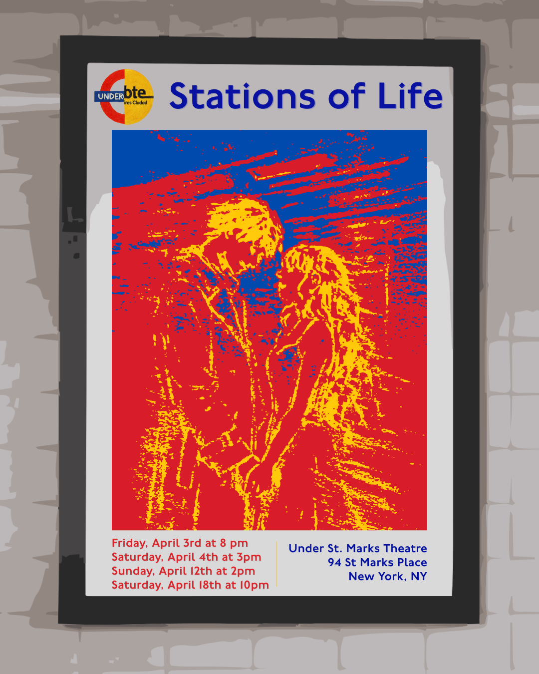
This alternate version for STATIONS OF LIFE replaces the company and festival logos with the performance dates and location at the iconic Under St. Marks Theatre in Saint Marks Place, New York. This design allows the underground transit aesthetic to shine through authentic typographic details. Our design employs Johnston, the London Underground's proprietary typeface, for the blue venue information, while show dates appear in red—directly referencing the iconic color palette shared by both the London Tube and Buenos Aires Subte systems. Our French-American approach honors European design heritage through careful attention to transit typography and wayfinding systems while embracing American pragmatism in clear, accessible event communication. The result is a poster that functions as both artwork and transit map, guiding audiences to their theatrical destination with the clarity of a well-designed subway sign.